
American writer Gregg Easterbrook once wrote “torture numbers and they’ll confess to anything” – and he had good reason. Misuse and manipulation of statistics happens all around us: in advertising, in the press and even in criminal trials. Manipulation of statistics can have an impact on things as far ranging as what toothpaste you decide to buy, or whether you are convicted of murder.
Since the beginning of the COVID-19 pandemic, governments and media outlets have tried to inform the public of the developing crisis via graphs and statistics. As with anything, these statistics can be misunderstood or even manipulated to sway public behaviour or opinion. For this reason we’ve decided to explain some of the most common fallacies and tricks involving statistics below.
Be Wary When Statisticians Use Discrete Numbers Instead Of Rates
Distinguishing between discrete numbers (that’s the use of whole numbers or individual data entries, to you and me) and rates is important in statistics. Both have their use in data analysis, but statisticians attempting to hide information may list discrete numbers instead of rates deliberately. Discrete numbers on their own mostly do not convey a lot of information, even if they are presented in a way that seems meaningful.
Countries’ population sizes vary, so looking at discrete numbers of deaths alone doesn’t convey a great deal of information In the case of COVID-19, mortality rates (ie, the number of deaths per million people in the population) are broadly better indicators of any given country’s efficacy at handling the pandemic than using whole numbers. Using whole numbers prevents real cross-country comparison, so authorities may choose to use these for this reason.
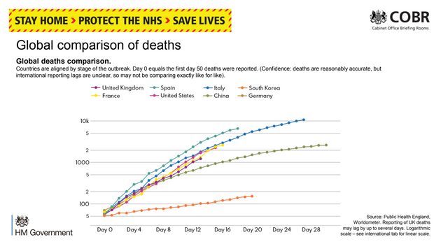
UK Government Global Death Comparison Graph. Source: Huffington Post
However, discrete numbers do have their use. For example, the use of discrete infection numbers instead of infection rates may be helpful at the beginning of a pandemic. When the number of COVID-19 cases was low and most (if not all) cases had been imported from other countries, the discrete number of infections could give a reasonable picture as to how well public health authorities had contained the virus. Once infection becomes widespread or endemic, as it has in the UK at the time of writing, discrete numbers are less useful in understanding the efficacy of public health measures than using rates.
Biased Labelling
When encountering a graph, it’s always important to check what scales the graph is using. A common tactic to alter public opinion is to choose scales that exaggerate an effect. A regularly cited example of this is a Fox News graph displayed during the proposed expiration of the Bush Tax Cuts in 2012:
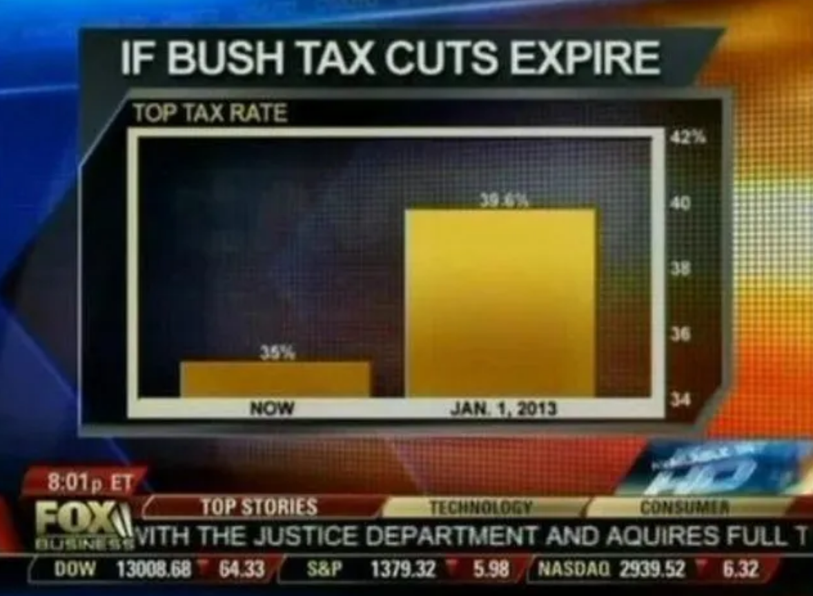
Fox News Bush Tax Cuts Graph. Source: flowingdata.com
The Fox News graph makes it appear as if the tax rate will increase dramatically once the tax cuts expire. But the graph only shows values between 34% and 42%. If the graph were to use a scale that begins at 0%, this is what the same information would look like:
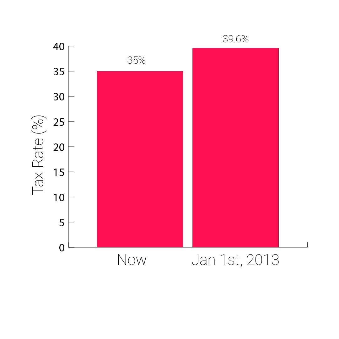
This is how the Fox News graph could have looked
In behavioural economics, one impact biased labelling can have is called “anchoring”. Anchoring happens when the first data entry in a list alters the perception of the values that come after it. It’s easiest to explain this with an example. If choosing between three similar, but differently priced, gift packages to send a friend, the order these prices are presented to the buyer will influence their perceptions and behaviour. Listing the most expensive package first “anchors” the buyer’s perception as to how reasonable the pricing is. Listing the least expensive package first also does the same. It is for this reason that many companies’ price comparison web pages list the most expensive items first – this nudges users into purchasing a more expensive package than they would have done if the least expensive had appeared first.
When analysing COVID-19 graphs, it’s important to note the choice of samples and labelling of axes, because anchoring effects also occur when statistics only show a limited time series. Showing the public a graph displaying COVID-19 deaths beginning with data entries from the peak of the epidemic (the time when deaths are at their highest) may nudge the reader into thinking public health authorities have done a good job. It could be that using a different time series, for example showing deaths from the first one, would paint a very different picture.
Correlation Does Not Imply Causation
When a statistical test shows a correlation between A and B, there are usually seven possibilities that can be considered:
- A causes B.
- B causes A.
- A and B both partly cause each other.
- A and B are both caused by a third factor, C.
- B is caused by C which is correlated to A.
- A is caused by C which is correlated to B.
- The observed correlation was due purely to chance.
The seventh possibility can be quantified by statistical tests that ascertain the likelihood that correlation occurred by chance.
There are some fun examples of abuse of correlations – the satirical Church of the Flying Spaghetti Monster, for instance, often cites the dramatic decrease in pirates since the 1800s as the cause of climate change – but abuse of correlations can have implications for public health decisions.
In the 1980s, prior to the discovery of HIV, scientists hypothesised that a rare cancer named Kaposi’s Sarcoma was caused by the use of amyl nitrate (informally known as “poppers”). It wasn’t until many years later that it was discovered AIDS caused the vast majority of Kaposi’s Sarcoma cases, and that the communities that abused amyl nitrate also had higher rates of HIV than those that did not.
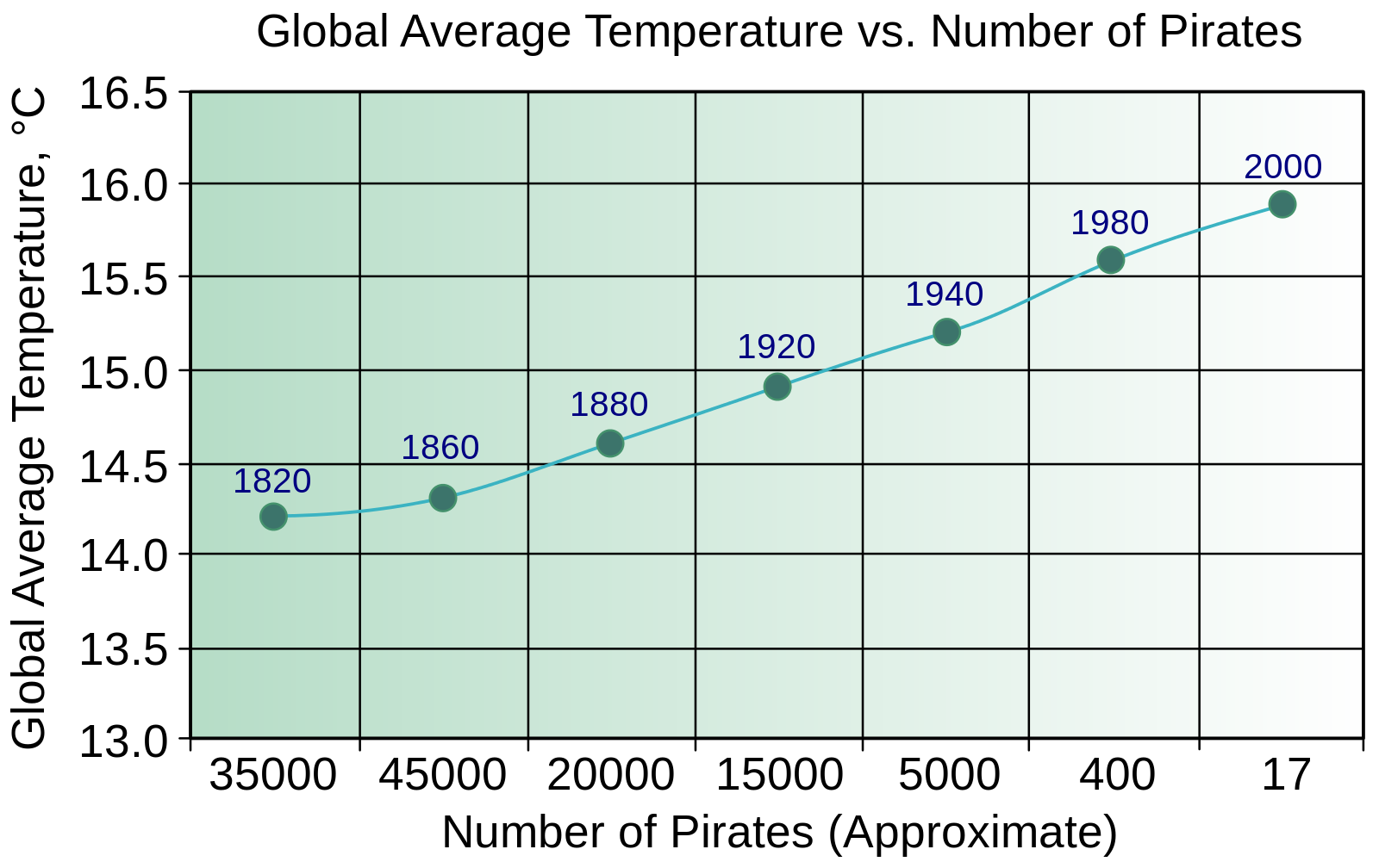
The number of Pirates is negatively correlated with the average global temperature. Source: wikimedia.org.
Simpson’s Paradox
Simpson’s paradox occurs when multiple data sets are combined and create a very different trend to that of the data sets individually. The most cited example of this paradox relates to the University of Berkeley graduate school admissions rate: it was noted the graduate school admitted 44% of male applicants and 35% of female applicants. While superficially this appears to indicate a gender bias against female applicants, the reality was that women had (on average) applied for more competitive graduate programmes compared with men, and per course had higher rates of admission to men – but the competitiveness of the courses meant the overall average of admissions made it appear there was a gender bias against women.
Simpson’s Paradox has become a talking point since the UK government announced the national COVID-19 reproduction rate (R) had increased despite the introduction of lockdown measures. In May, when presenting evidence to a parliamentary committee Professor John Edmunds of the London School of Hygiene and Tropical Medicine indicated that this headline news – that R had increased – painted an incomplete picture. He noted that the reproduction rate in hospitals and care homes was high, but those areas of the country with high proportions of elderly people had (on average) a lower risk of COVID-19 death.
“We had a very wide-scale community epidemic,” he told the committee, “and when we measured the R it was primarily the community epidemic. But that’s been brought down: the lockdown has worked, breaking chains of transmission in the community … now if you measure the R it’s being dominated by care homes and hospitals.”
Prosecutor’s Fallacy
Prosecutor’s fallacy occurs when the probability of A given B is confused with the probability of B given A. This sounds confusing at first glance, but it is easier to understand with an example.
Imagine you have a box that contains an animal. Then ask yourself the following question:
Assuming the animal inside is a dog, what’s the chance it is an animal that has four legs?
The probability of that will be pretty high, around 100% – complete certainty. But let’s consider the following question:
Assuming the animal inside has four legs, what’s the chance it is a dog?
This probability will be a lot lower than 100% – there are plenty of other animals it could be while still having four legs.
The difference between these two probabilities and questions may seem hypothetical, but confusion between these two statistics has had a major impact on the outcome of criminal trials – hence why it is named the “prosecutor’s fallacy”. Imagine that eye witnesses to a robbery had seen that a lady with ginger hair was responsible. If the prosecutor were to think “assuming the person on trial is the robber, what’s the probability the person is a lady with ginger hair?” (close to or equal to certainty) but confused this with “if the accused is a lady with ginger hair, what’s the probability they are the robber?” (probably quite low), then an innocent person could easily be found guilty of the crime.
Presenting one probability as the other has serious implications for the outcomes of our criminal justice system. One prominent example of this misuse of statistics was the trial of Sally Clark in the UK. Clark had two children who had both died suddenly. Having suffered two infant deaths due to Sudden Infant Death Syndrome (SIDS, informally known as “cot death”), she was tried and found guilty of murder on the basis of this statistical fallacy. The expert witness, a paediatrician named Roy Meadow, claimed that there was a 1 in 73 million chance that Clark could have two children suffering from a SIDS death in a row. He was ultimately referred to the General Medical Council, who originally struck him off the medical register in 2005. He ultimately was reinstated after winning an appeal against this decision in 2006. Other women convicted on the basis of his testimony were ultimately acquitted.
Conjunction Fallacy
Conjunction fallacy occurs when people falsely assume that the probability of A and B is higher than the probability of A alone. Again, it’s easiest to explain this with an example. Kahneman and Tversky, behavioural economists, cite this example of the fallacy:
“Linda is 31 years old, single, outspoken, and very bright. She majored in philosophy. As a student, she was deeply concerned with issues of discrimination and social justice, and also participated in anti-nuclear demonstrations.” A group of people were asked if it was more probable that Linda was a bank teller or a bank teller active in the feminist movement.”
The majority of participants chose the latter, but statistically this is almost an impossibility: the probability of two things happening together is always less than or equal to the events occurring individually. The probability of someone being a bank teller is equal to the probability of someone being a bank teller and active in the feminist movement PLUS the probability of someone being a bank teller and not active in the feminist movement.
Absence of evidence isn’t the same as evidence of absence
This confusion can cause problems in statistics. More specifically, in the area of COVID-19 virus PCR testing, receiving a negative test result does not necessarily mean a person does not have the virus. It instead means that the PCR test hasn’t picked up a large enough sample of viral DNA to detect the virus. Some cases in East Asia tested positive, then negative for COVID-19 before testing positive again a few days later. Some scientists think that this was caused by the COVID-19 virus appearing to be reactivated and causing a second illness in some cases. However, it is possible that the virus was still active in these individuals despite testing negatively for it. It may be that the amount of viral material present in the body had simply decreased to so low a level that the PCR test was unable to detect it.
Sampling Bias & Moving The Goalposts
When looking at statistical graphs and diagrams, it’s important to note the sample size and the characteristics of the sample under investigation. In late April 2020 it appeared as though the number of UK COVID-19 infection numbers had spiked. However, this spike is likely to have been the results of the change in the testing protocol (allowing NHS workers and some people in the broader community to obtain a COVID-19 test) implemented at that time. The more tests carried out by public health authorities, the more positive test results will likely be returned. When the government was aiming to meet a daily 100,000 COVID-19 test target, it began including tests that had been mailed out to people in the community, when previously these results had not been included. Moving the goalposts and altering which samples are under study can be used to hide problematic data findings, so it’s understandable that there was an outcry when this happened.
Small sample sizes can also cause problems. When studies involving five people say that “20% of people suffer from a deadly disease”, this in reality means that one person out of a cohort of five did. Small sample sizes may lead to problems in interpreting data, especially when entire countries are being studied, as is the case with COVID-19: it’s hard to draw conclusions about entire populations on the basis of small sample sizes.
One problem in the early stage of the pandemic was that many published scientific papers would present the results of studies having small numbers of participants, primarily because there weren’t enough active COVID-19 cases available to be studied. This problem is now much reduced, because large sample sizes are now possible due to the high numbers of people who have tested positive (or have suffered from) COVID-19.
Selective Reporting & Publication Bias
Leaving to one side personal bias and statistical errors for a moment, the way statistics are reported can have a detrimental impact on our understanding of the world. Here are three examples.
One problem that can occur when reporting statistics is named “selective reporting.” Selective reporting involves cherry-picking data to alter a study’s conclusions, or reporting in a way that may mislead the end user. One prominent example of selective reporting involved a 2007 Colgate advertisement in the UK. The advert claimed that “80% of dentists recommend Colgate”, when this statement was misleading. The study this statement was citing asked dentists to recommend brands of toothpaste, but did not limit them to one brand: it was perfectly possible, therefore, for a brand other than Colgate to have a 100% recommendation rate, regardless of Colgate’s 80% figure. The UK’s Advertising Standards Authority ruled the advert misleading and hence it was scrapped. It claimed:
“The ASA did not share Colgate’s convictions and it upheld both complaints against the poster campaign. It was the view of the ASA that the claim “More than 80% Of Dentists recommend Colgate” would be understood by readers to mean that 80% of dentists recommended Colgate over and above other brands and the remaining 20% of dentists would recommend different brands rather than Colgate.”
While the Colgate advertisement may come under the broad heading of “selective reporting”, there are many other ways of using data to confuse or mislead the general public. One such tactic is to conflate changes in percentage points with changes in percent. Imagine you had a skin care product, which improves outcomes in 5% of users. Another, different, skin care product improves outcomes in 10% of users. If you were advertising the second product, would you say that this product is 5% or 100% better than the first one mentioned? Both could be viewed as accurate statements, but they appear to give a very different impression.
While this may again seem hypothetical, this kind of misleading reporting of statistics occurred when the UK Committee on Safety of Medicines issued a warning in 1995 stating that a birth control pill increased the risk of life-threatening blood clots by 100%. In reality, the study noted that the number of women suffering blood clots increased from 1 in 7000 to 2 in 7000. It wasn’t incorrect to state that the number of women suffering blood clots had doubled, but this statement was potentially misleading.
Conclusion
Statistics can be phenomenally useful and can enhance our understanding of the world, but they can also be used selectively to change political narratives, sway public opinion, or to alter public policy. The fallacies and problems in this article only comprise some of the problems we encounter when trying to interpret statistics – this list is not exhaustive. We hope you enjoyed our summary of these problems. If you enjoyed this article, you may also like our article on the problems associated with comparing COVID-19 mortality rates. Click here to read it.